Improving PayPal's cashback deals through rapid research
Overview
As a Rapid Researcher at PayPal, I led fast-turnaround qualitative studies across various products including Venmo, consumer and merchant experiences, and developer tools. Over time, I conducted more than 80 usability and comprehension studies that helped teams make confident design decisions.
Goal: Identify usability barriers in PayPal's new cashback rewards through rapid qualitative research.
Outcome: 19% increase in transaction rates by uncovering critical comprehension gaps that would have killed engagement.
The team wanted to understand how relevant their cashback offers were:
PayPal introduced cashback rewards as part of their effort to become the most rewarding way to pay. With one week before launch, the team requested a final usability and comprehension study to identify any issues that could impact engagement or revenue.
Key stakeholders: UX researchers, designers, product managers, and content strategists
Research questions:
Are the cashback offers compelling and relevant?
Do users understand which purchases are eligible for cashback?
Are there usability or comprehension barriers preventing engagement?
To understand these questions, I conducted a live usability test.
The team initially planned to test the cashback widget using generic offers, but this wouldn't reveal whether users found the offers relevant. To get meaningful insights, I recommended a live usability test—a first for PayPal's Rapid Research program—where participants interacted with real cashback offers tailored to their purchase history.
I worked with data science to:
Recruit active PayPal customers instead of relying on an external panel
Ensure participants' accounts were enrolled in the cashback experiment so they could engage with actual offers
This approach was critical because testing with real offers would show us actual user behavior rather than hypothetical responses.
My analysis process was quick and structured:
With just a week to turn research around, my analysis process had to be structured and efficient. After each session, I reviewed notes and transcripts to identify patterns in user behavior, pain points, and misunderstandings.
My synthesis approach:
1. Extract key observations: I pulled direct quotes, behaviors, and moments of friction from session notes and transcripts.
2. Group similar themes: I categorized issues based on frequency and impact, making sure findings weren't just surface-level but pointed to broader usability trends.
3. Prioritize insights: Not all issues carry the same weight. I focused on those with the highest potential to affect engagement and revenue.
4. Structure findings for clarity: I framed key issues in a way that resonated with stakeholders:
What users struggled with
Why it mattered (business impact)
How we could fix it
To make the insights more tangible, I incorporated direct user quotes and, when possible, short video clips highlighting usability challenges.
Three major barriers emerged that would hurt launch performance:
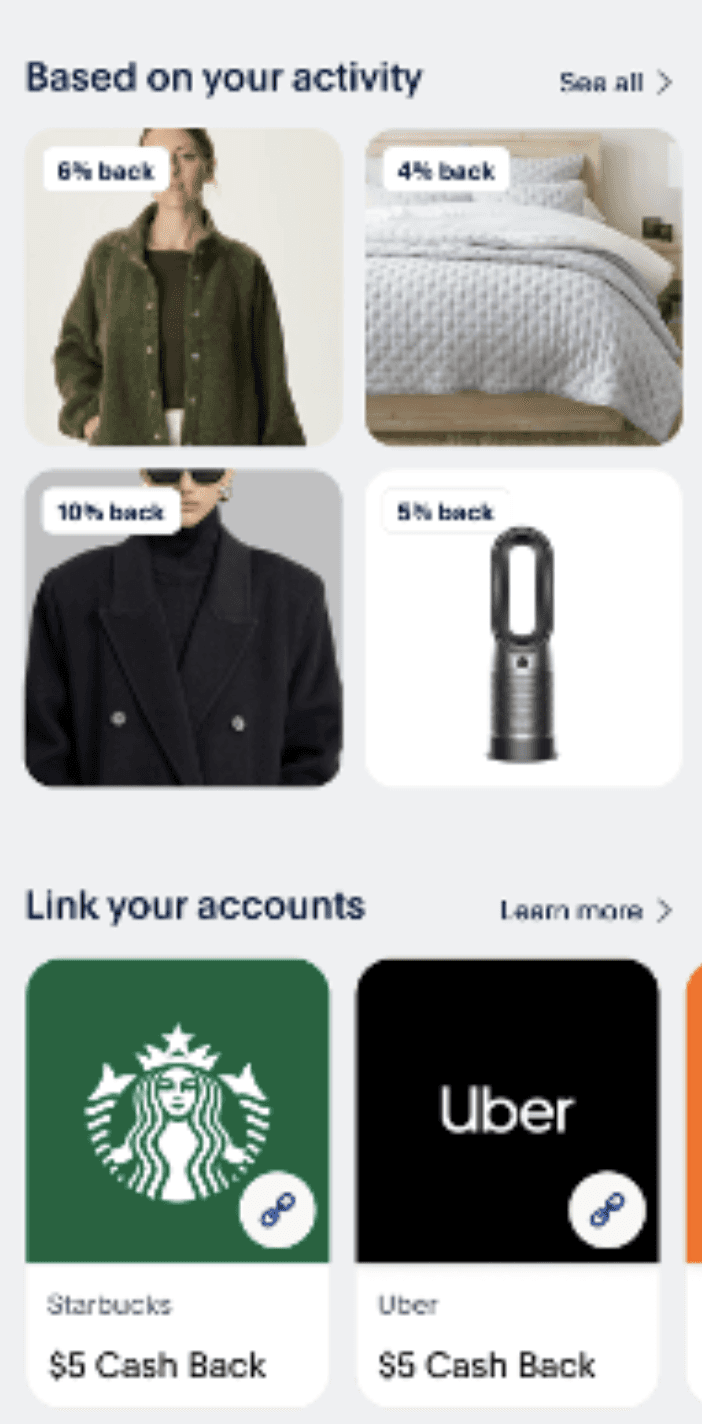
Users couldn't identify products
Product images alone left participants confused: "What is this item?" and "Which store am I going to?"
Without clear context, users hesitated to engage, reducing transaction potential.Eligibility confusion killed trust
Users incorrectly assumed items weren't eligible for cashback due to unclear messaging, skipping purchases that actually qualified for rewards.Poor personalization felt irrelevant
Participants received offers completely misaligned with their behavior (like hunting gear for folks who never hunt), making the entire feature feel like spam.

I recommended SKU level data to fix these issues:
To address these issues, I recommended adding SKU-level data (brand, item name, and price) to cashback tiles. The product team ran an A/B test:
Control: Product images only
Variant: Images with SKU-level details
My research-backed recommendations improved transaction metrics by 19%.
19% improvement in transaction rate in the variant group
Users clicked on fewer items overall, but clicks were more intentional and led to higher spend
Following this success, the team iterated further by adding price information, which is now the standard design in the PayPal app

Learnings
This project reinforced the power of qualitative research, even on tight timelines. It also taught me how to quickly ramp up on unfamiliar products, ask the right questions, and deliver insights that drive meaningful change.